An interesting study indicates that — after an elapsed period of 15 minutes — readers tend to remember information better if it’s been set in an annoying font like Comic Sans or Bodoni as opposed to an easy-to-read font like Arial. Note that has nothing to do with legibility and reading pleasure, it just means readers were more inclined to remember information set in a horrible font.
A single sentence was presented in four different typefaces:
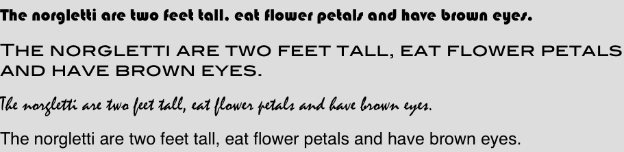
Attempting to reconstruct a biological taxonomy lesson, the researchers asked 28 adult volunteers to learn about the norgletti and two other kinds of aliens, each of which had seven features. The participants saw these characteristics listed in either gray, obnoxious Comic Sans MS, or gray, delicate Bodoni MT, or black, clear-as-day Arial font, and had 90 seconds to memorize the lists. They were distracted for 15 minutes, and then tested on their retention with questions such as What color eyes does the norgletti have?
The volunteers who learned the information in Arial answered 73 percent of the questions correctly, whereas those who read it in hard-to-read fonts had 87 percent accuracy. (There was no difference between the two annoying fonts.)
The results have enormous implications for education. But would this font-switching strategy do any good in a real classroom?
In a second experiment, the team changed the fonts of PowerPoint slides and classroom handouts for a variety of classes taken by 222 high school students. For up to a month, some students received the materials in italicized Comic Sans, some in Haettenschweiler and some in Monotype Corsiva — all of which are difficult to read. (In fact, one teacher refused to pass out the materials in Haettenschweiler.)
Students who had received the ugly handouts scored higher on tests of the material than did their peers who had used normal type. This happened in every subject tested — chemistry, English, history and physics.
The researchers propose that when we see an illegible font, our brains have to ramp up their processing power in order to read it. We have to concentrate more, and this helps with memory.
(via The Last Word On Nothing)


Comments on this entry are closed.