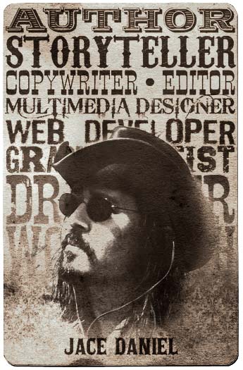
Good ol’ Saul Bass. Designer of some of the best logos ever, such as Bell Telephone, AT&T, Quaker Oats, Dixie, and Continental Airlines, he’s probably best known for his movie posters and title sequences, particularly the mid-century classics which include Hitchcock’s Vertigo, North by Northwest, and Psycho.
Kinetic typography was Bass’s thing, and was revolutionary at the time. Bass’s use of kinetic typography has influenced countless pieces of work over the decades (one of my favorites examples would be the title sequence for Catch Me If You Can), and is an entire area of study. A few years ago I attended a seminar that included a session on the Art of Film Titles, a field with standards set by Saul Bass. My notes from that seminar are here.
Here’s a great video of Bass discussing his movie title sequences:
“My initial thoughts about what a title can do was to set mood and the prime underlying core of the film’s story, to express the story in some metaphorical way. I saw the title as a way of conditioning the audience, so that when the film actually began, viewers would already have an emotional resonance with it.”
— Saul Bass


Comments on this entry are closed.