Client: Fandango
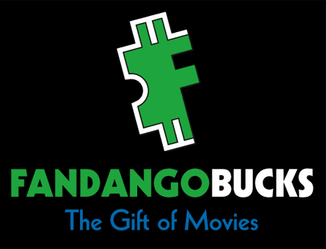
Logo Design for “Fandango Bucks” Gift Certificates
2005
Fandango needed a new logo for their gift certificates called “Fandango Bucks”. The logo needed to be separate from the Fandango mark, yet still reflect the Fandango identity. The original logo mark, which is an F created out of a ticket stub, was modified to include the two vertical lines from the US Dollar sign. Green was proposed as a replacement for the corporate orange in order to better separate it from the mother identity. The green suggests the idea of money, while the geometry is undeniably Fandango.


Comments on this entry are closed.