Responsive web design (RWD) is an approach to web design aimed at crafting sites to provide an optimal viewing experience—easy reading and navigation with a minimum of resizing, panning, and scrolling—across a wide range of devices (from desktop computer monitors to mobile phones).
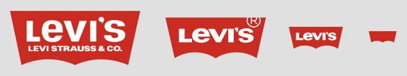
Here’s a cool page of responsive brand logos that show RWD in action. Notice how the logos respond as you shrink your browser window, discarding detail and becoming more abstract.
Levi’s:
Other examples include Coke, Chanel, Nike, Guinness, Kodak, Warner Bros, and Heineken.


Comments on this entry are closed.