After my recent blog post on the popularity of chess moves over time, my brother admitted that he was confused by the data. It was presented using an “area chart” model, displaying chess opening trends in percentages over time.
He’s not alone. Stacked area charts can indeed be misleading. Dr. Drang demonstrates where the confusion is in a fictitious example.
Here’s a timeline of the change in market share, in percent, of three companies that are the only manufacturers of a particular device. We’ll call the companies Orange, Green, and Blue and use those colors in our charts. Let’s look at this chart. ↓
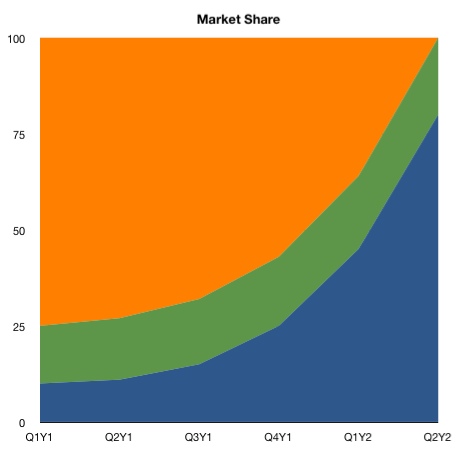
Not exactly intuitive if not given an explanation on how to read it. If it’s not clear to you: in Q2Y2, Blue had 80%, Green had 20%, Orange had 0%. Compare that to Q1Y1, where Blue had 10%, Green 15%, and Orange 75%.
While the data’s there, it’s not easy to see.
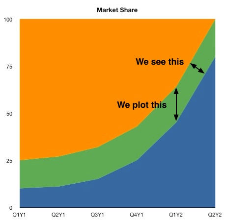
The discrepancy arises because the chart plots the market share vertically, but we perceive the thickness of a stream at right angles to its general direction. ↓
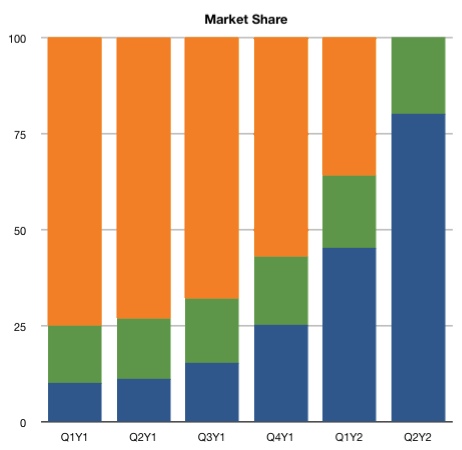
Drang proposes a solution: to replace the stacked area chart with a duller stacked column chart:
Read the full study here.
And if you really want to go deep, check out Edward Tufte’s classic book on the subject, The Visual Display of Quantitative Information.


Comments on this entry are closed.