The following are notes taken during a session held by Matt Silverman at the After Effects West seminar in 2001, now permanently logged for reference purposes.
Color Theory: The Art of Color PickingMotion graphics and visual effects artists are often expected to be both hybrid filmmakers and designers. Very few have formal training in both of these fields. This article will explore the design side of our craft, focusing on the often overlooked aspect of creating harmonious color schemes (as developed by artists over the centuries.) Discover how traditional color theories apply to modern day motion graphics, broadcast design, and visual effects.
What is color?
From Dictionary.com:
col•or
1. The aspect of things that is caused by differing qualities of the light reflected or emitted by them, definable in terms of the observer or of the light, as:
a. The appearance of objects or light sources described in terms of the individual’s perception of them, involving hue, lightness, and saturation for objects and hue, brightness, and saturation for light sources.
b. The characteristics of light by which the individual is made aware of objects or light sources through the receptors of the eye, described in terms of dominant wavelength, luminance, and purity.
2. A substance, such as a dye, pigment, or paint, that imparts a hue.
How the human eye perceives color
“Light enters the eye as a spectrum of colors, distributed by wavelength. This spectral distribution function impinges on the retina in the back of the eye and is absorbed by the cones. Human beings have three types of cones, whic respond to different wavelengths of light. These are called either long, medium, or short wavelength cones. Each cone absorbs light and sends a signal to the brain. That is, the spectrum of light is encoded into three values that correspond to the amount of light absorbed by each type of cone. This is the principle of chromacy — human vision is 3 dimensional.” (1)
“Colors are forces, radiant energies that affect us postively or negatively, whether we are aware of it or not. The artists in stained glass used color to create a supramundane, mystical atmosphere which would transport the meditations of the worshiper to a spiritual plane. The effects of colors should be expressed and understood, not only visually, but also psychologically and symbolically.” (2)
Due to these effects of color, we must examine color from multiple aspects.
Color from the physicist’s point of view“The physicist studies the nature of the electromagnetic energy vibrations and particles involved in the phenomena of light, the several origins of color phenomena such as prismatic dispersion of white light, and the problems of pigmentation. He investigates mixtures of chromatic light, spectra of the element’s frequencies, and wavelengths of the colored light rays. Measurement and classification of colors are also topics of physical research.” (3)
Color from the chemist’s point of view
“The chemist studies the molecular structure of dyes and pigments, problems of color fastness, vehicles, and preparation of synthetic dyes. Color chemistry today embraces an extraordinarily wide field of industrial research and production.” (4)
Color from the physiologist’s point of view
“The physiologist investigates the various effects of light and colors on our visual apparatus – eye and brain – and their anatomical relationships and functions. Research on light – and dark – adapted vision and on chromatic color vision occupies an important place. The phenomenon of afterimages is another physiological topic.” (5)
Color from the artist’s point of view
The artist finally is interested in color effects from their aesthetic aspect, and needs both physiological and psychological information.Motion graphics and visual effects artists are for the most part commercial artists. Commercial artists are expected to use color and composition to influence people. Viewing color from a physiologist’s point of view is important because it allows you to tap into the primal color relationships all humans share. The phenomenon of afterimages leads artists to the notion of complementary colors, which leads to other formulas developed by Itten in the Bauhaus. Viewing color from a psychologist’s point of view is important because it allows you to tap into the emotional side of your viewer by utilizing color relationships generated from sociological and psychological stigmas engraved in our mind.
The physicist’s point of view and the chemist’s point of view are valuable for understanding technical issues rather than artistic issues. The color physicist was responsible for the current RGB color system used to define a pixel on computer monitors and in computer graphics, as well as the YUV system used in video. The color chemist was responsible for the current CMY color system used in printing. The color chemist continues to refine this system with new ink technologies like archival ink, as well as new advanced color systems containing CMY plus other colors like black and orange to make up a wider gamut of printable colors. Color phsyicists and color chemists are the people who make the tools we use today to create art, even though their perception of color is based on science rather than art.
As an artist, these systems are pretty much transparent, and do not need to be considered when dealing with harmonious color combinations. The relationships between harmonious colors does not change from one color system to another, or whether you are dealing with additive or subtractive color spaces. Whether you are looking at a red stop sign containing subtractive colors or a red stop light made up of additive colors, the color of both are red. They might be different shades of red, and the hue might be slightly different, but if you were to ask the person in the car next to you what color they were looking at they would say red. And just as they are both red, they both have a harmonious complementary color which does not change just because one is a light source and the other is reflective. Scientifically, the opposite colors on the color wheel might be different if you look at the components that made up the phosphors to create the traffic light versus the pigments used to print the stop sign. Again, this is based on the scientific components, and not the aesthetic colors involved.
Primary Colors
Reflecting the way that the human eye works in three dimensions, Primary Colors refer to three pure colors which, when combined together, can create any other color in the spectrum. Some color models use more than three pure colors to help overcome deficiencies in their system. Different systems are used for different purposes, most of which are strictly based on science rather than art.
RGB
The RGB model is made up of Red, Green, and Blue primaries. This is the system which most computer based imaging applications use. It is a scientific representation for how a pixel is defined based on the primary components red, yellow, and blue. This system has only been used for the past half century or so, and has no basis on traditional art. It is purely scientific, and traditional harmonious color formulas do not work with this system due to the fact that complementary colors are very different than traditional color systems made up of red, yellow, and blue primaries.
RYB
As children, most grammar school students are taught that the primary colors are red, yellow, and blue (RYB). Red and yellow mix to create orange, blue and yellow mix to create green, and red and blue mix to create violet. These mixtures of orange, green and violet are known as the secondary colors. Mixing the secondary and primary colors creates tertiary colors. This RYB model has been used for centuries by traditional artists to mix paints. Complementary colors are the opposite colors on the RYB color wheel, and reflect the afterimage of a reflective surface such as a paint canvas. The afterimage is the basis for the traditional color theory derived by Johannes Itten in the Bauhaus.
Historical overview of harmonious color theory
For centuries, artists and scientists have studied color. The first known article about color theory goes all the way back to Plato’s Timaios, c. 360 B.C. The fact that color is a phenomenon all humans have in common (with the exception of blindness or color blindness), made it an obvious curiosity which deserved in-depth study. A very complete chronological bibliography on color can be found at http://www.fadu.uba.ar/sicyt/color/bib.htm
Early artists relied on natural pigments found in nature, which limited the number of possible color schemes based on the geographical location of the artist. As time went on, more colors became available to the artist, up to the present day where digital artists are faced with choosing from millions, and now with advanced tools like Adobe Photoshop and After Effects, trillions of colors.
“The ancient Egyptians and Greeks greatly delighted in varicolored designs. The Chinese have been accomplished painters from early times. An emperor of the Han dynasty is recorded in 80 B.C. to have kept storehouses – a museum – of paintings collected by him, said to have been of great and colorful beauty. In the T’ang period (618-907 A.D.), there arose a strongly colored mural and panel painting. About the same time, new yellow, red, green, and blue ceramic glazes were developed. In the Sung dynasty (960-1279 A.D.), the sense of color was extraordinarily cultivated. Pictorial colors became more varied and at once more naturalistic. Ceramics evolved many new glazes of matchless beauty, cuch as celadon and clair de lune.”(7)
The Masters
Early Master artists had an inane sense of color harmony. Many studied harmonious relationships used by earlier masters. Early Roman and Byzantine mosaics from the first century which are still preserved today “placed high demands on coloristic powers, because each color area is composed of numerous point elements, each requiring consideration and choice.” (8)
Complementary colors, or opposite colors, have been used for centuries by master artists. “The mosaic artists of Ravenna in the fifth and sixth centuries were able to produce many different effects with complementary colors. The Mausoleum of Gaulla Placidia is dominated by a remarkable colored atmosphere of gray light. This effect is produced by bathing the blue mosaic walls of the interior in an orange light, filtered through narrow windows of orange tinted alabaster. Orange and blue are complementary colors, the mixing of which yields gray. As the visitor moves around the shrine, he receives different quantities of light which is alternately accented blue and orange, the walls reflecting these colors at ever-changing angles. The interplay gives an impression of suffusion with color.” (9)
Over the centuries, Master painters and artists utilized color and contrast to create the great works of art. By analyzing their color schemes, utilizing physiological and psychological color principles, and loosely applying the scientific research and theories, certain color combinations have been found to be harmonious to humans.
Isaac Newton
Two thousand years after Plato and Aristotle published their studies on color, Isaac Newton published his studies in the 1704 book, Opticks: or, a treatise of the reflections, refractions, inflections, and colours of light. Newton’s experiments consisted of shining white light into a prism, which split the white light into 7 colors depending on their wavelengths. This was a sentimental moment in the history of physics and art, as it led to the RYB primary, secondary, and tertiary system used in future color theory.
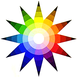
Phillip Otto RungeAdapting the research of Newton, in 1810 Master artist Phillip Otto runge set out to create a uniform color system. Runge mapped the pure hues around the equator of a globe and towards the north pole colors got lighter (tints), while towards the south pole colors got darker (shades).
Johannes IttenAs a professor in the famed Bauhaus art school, Johannes Itten was responsible for creating the color curriculum. His studies on color have been published in the monumental book, The Art Of Color. Taking the idea of Runge’s Color Globe’s pure colors with shades and tints to the next level, Itten flattened Runge’s sphere into a star and used stencils to preview harmonious color combinations. Like musicians utilize a structured chord system, Itten found various color chords, all based on teh concepts of afterimage, complementary colors, and the neutral gray balance that the humane eye desires. Itten realized that complementary colors are not the only harmonious colors in the RYB system. The concept of an afterimage proves that the human eye wants a neutral gray balance, and when the retina gets over saturated with one color it wants the opposite color to balance it out. By using balanced stencils, Itten found the following formulas: Split Complementary, Three Way Splits, Four Way Splits, Six Way Splits, Four Tone Chords, Five Tone Chords, Six Tone Chords, and Analogous colors. From Itten’s studies, other formulas have been extrapolated like Neutrals, Dischord (Clash), and Five Way Splits. The harmonious color combinations derived by Itten are invaluable for anyone working with color.
Josef Albers
The 1963 book Interaction of Color by Josef Albers takes the studies of Itten to the next level, utilizing physiological experiments to learn more about the mysteries of color. Optical illusions and studies of colored paper allowed studients to grasp color harmony through hands-on experimentation.
Andy Warhol
As one of the forefront pop artists of his time, Andy Warhol utilized the harmonious color formulas developed by Itten in his later print work. Warhol created some very complex color palettes based on splits and chords. Considering that color was such a major part of the attraction to Warhol’s art, it is a great example of the power of traditional color theory.
Translating traditional harmonious color theory to the digital realm and why color schemes are important in modern designModern motion graphic designers are required to deal with the following elementss to make up a final product; composition, animation, iconography/typography, editing, and color. The overall color scheme should be decided early in the production process. Many times color needs to be based on existing corporate identity or previous color schemes. As a motion graphics designer, you are responsible for coming up with new colors that will work with existing schemes of corporate identity. When you present color schemes to your client or art director, like everything in this business, the more choices you have, the better off you’ll be. This is why a formal knowledge of color theory is important to your work. With a formal knowledge of color theory, you can create multiple examples of harmonious schemes to your client and have them pick their favorites to use in the project. Once this is done, you will be ready to concentrate on the composition, animation, iconography, and editing.
Traditional color wheels
Since Itten’s studies were published, many devices similar to Itten’s Color Start have been produced and marketed to the public. For the most part, these color wheels are made of cardboard, and have the pure colors along the edge of the wheel with different shades and tints pushing in towards the center of the wheel. Various formulas are represented by triangles and patterns in the center of the wheel, and you can rotate the wheel to change the input color for the formula.
The big downside of these color wheels for digital artists is that they are very limited. Not all of the traditional formulas developed by Itten are present, and they only represent about 40 different colors. As digital artists we can be incredibly precise with our input color, and the formulas can produce over 16 million colors. Traditional wheels just aren’t practical except for choosing arbitrary schemes based on a general hue. For precise color formulas, a digital color wheel is necessary.
Digital color wheels
After searching hopelessly for a digital color wheel for motion graphic production, Matt Silverman collaborated with ILM engineer Garrick Meeker to make ColorTheory and colorTheory DV. This digital color wheel, which works as a standalone application and plug-in for Photoshop and After Effects, allows you to find any of Itten’s traditional formulas based on the colors of existing artwork. A demo version and QuickTime tutorials can be downloaded at http://www.toolfarm.com
Recommended Reading:
The Art of Color by Johannes Itten
Interaction of Color by Josef Albers
Color Harmony Workbook by Rockport Publishers
Color Choices by Stephen QuillerFootnotes:
(1) A Survey of Color for Computer Graphics by Maureen C. Stone, Course 10 SIGGRAPH 2000, July 23, 2000
(2-9) The Art of Color by Johannes Itten, John Wiley & Sons Inc. 1961


Comments on this entry are closed.